CASE STUDY · BRAND IDENTITY & PACKAGING
Kumaon Organics
Identity · Packaging · Illustration · Website · Social Media · 2021
THE BRIEF
A brand born from the Himalayan foothills.
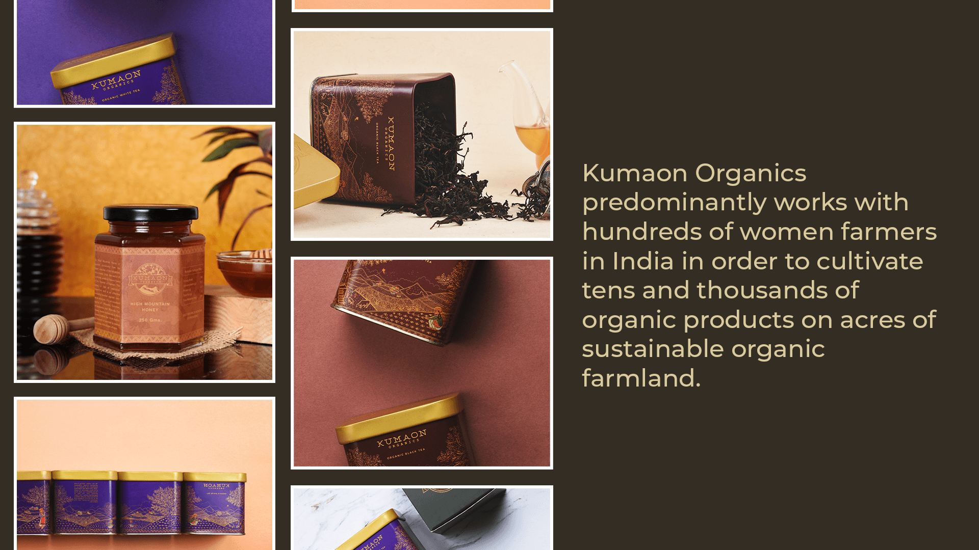
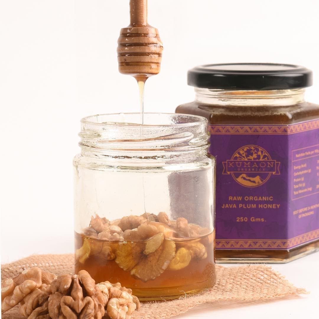
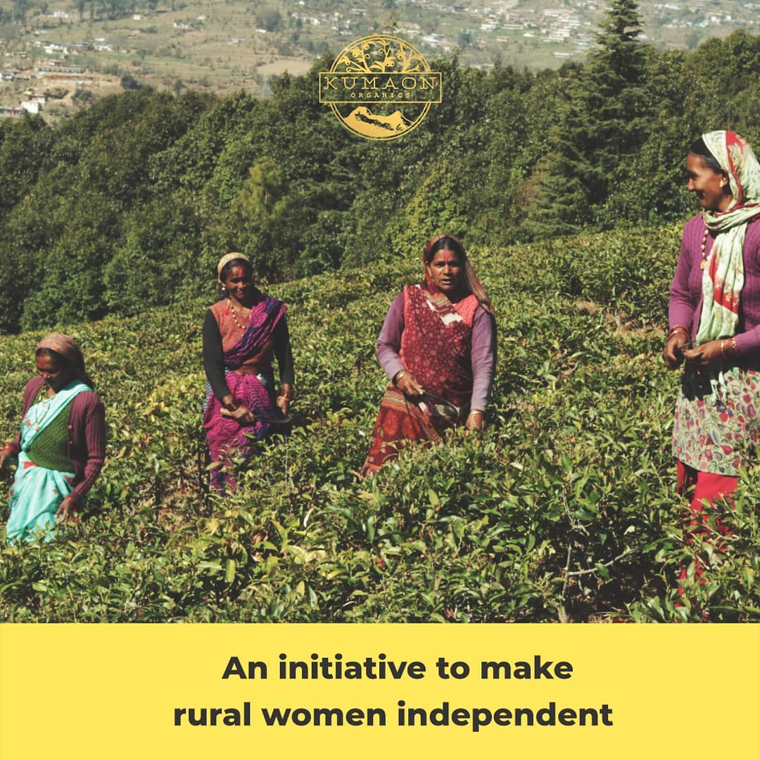
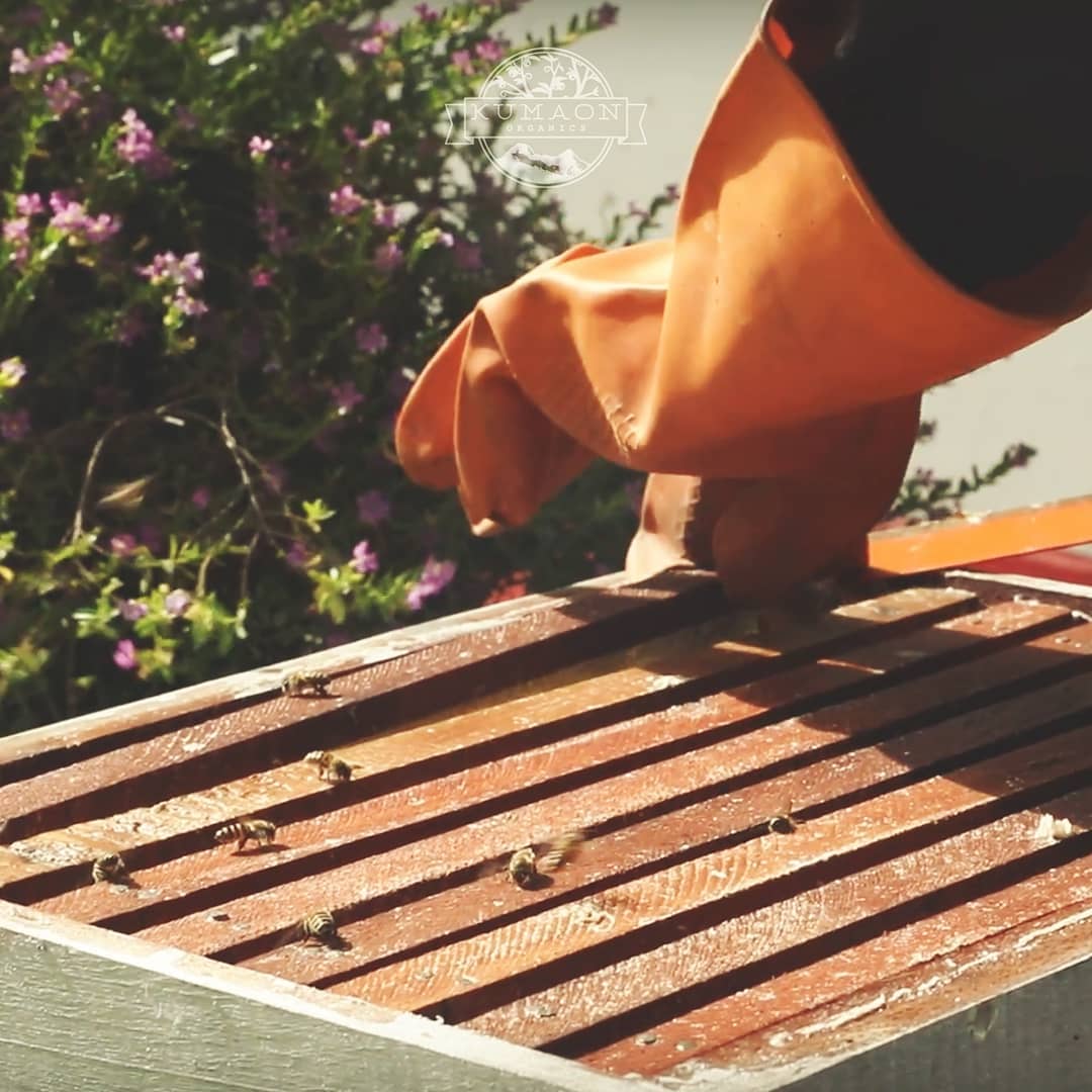
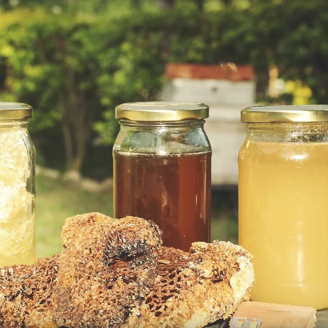
Gaurav Ladwal came to Sociomonkey with something rare — a product that was already extraordinary. Organic teas and honey grown by 450 women across 25 Himalayan villages, nurtured by glacial water at 1,800 metres above sea level. The brand had a soul. What it needed was a body, and we were given the full picture: brand strategy, a logo, hand-drawn tin packaging, a lookbook, a website, social media, photography, and video from the first sketch to the final product shoot.
THE CREATIVE CONCEPT
Every aspect of design is done by hand and followed by digital colour scheming. Our packaging is inspired by the evening sky and the earthly regions of Kumaon, Himalayas.
The result is a product that feels handcrafted at every point of contact — because it genuinely is.
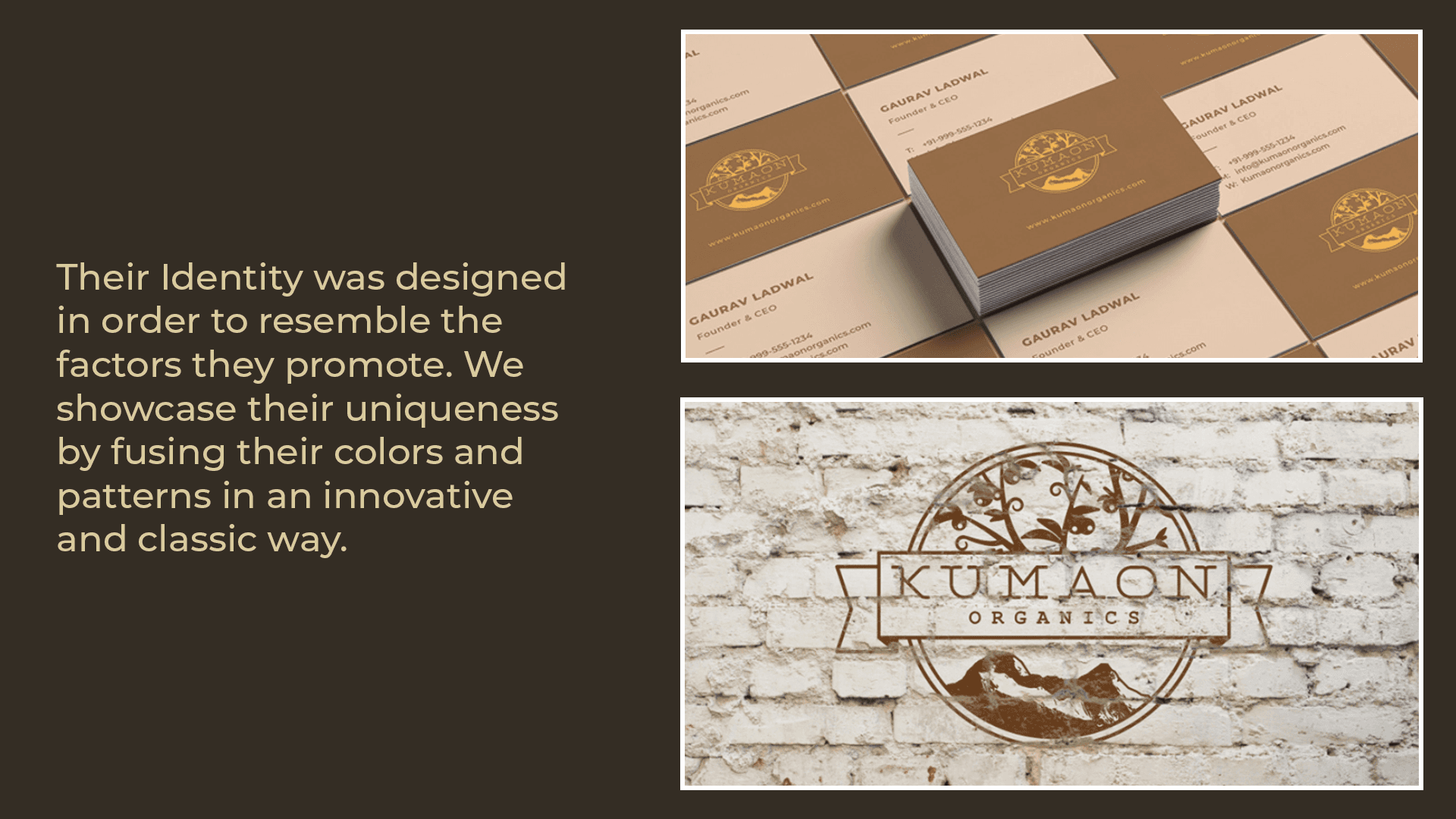
LOGO & IDENTITY
A badge that earns its place.
The circular badge brings two symbols of Kumaon together — the Kaphal, a bacciferous plant native to Uttarakhand, growing above, and the iconic Himalayan ridge rising below. Between them, the name. The logo works embossed in gold foil, stamped on kraft paper, printed on tin, and reversed on dark without losing its character at any scale.
INDIGO
CRIMSON
FOREST
GOLD
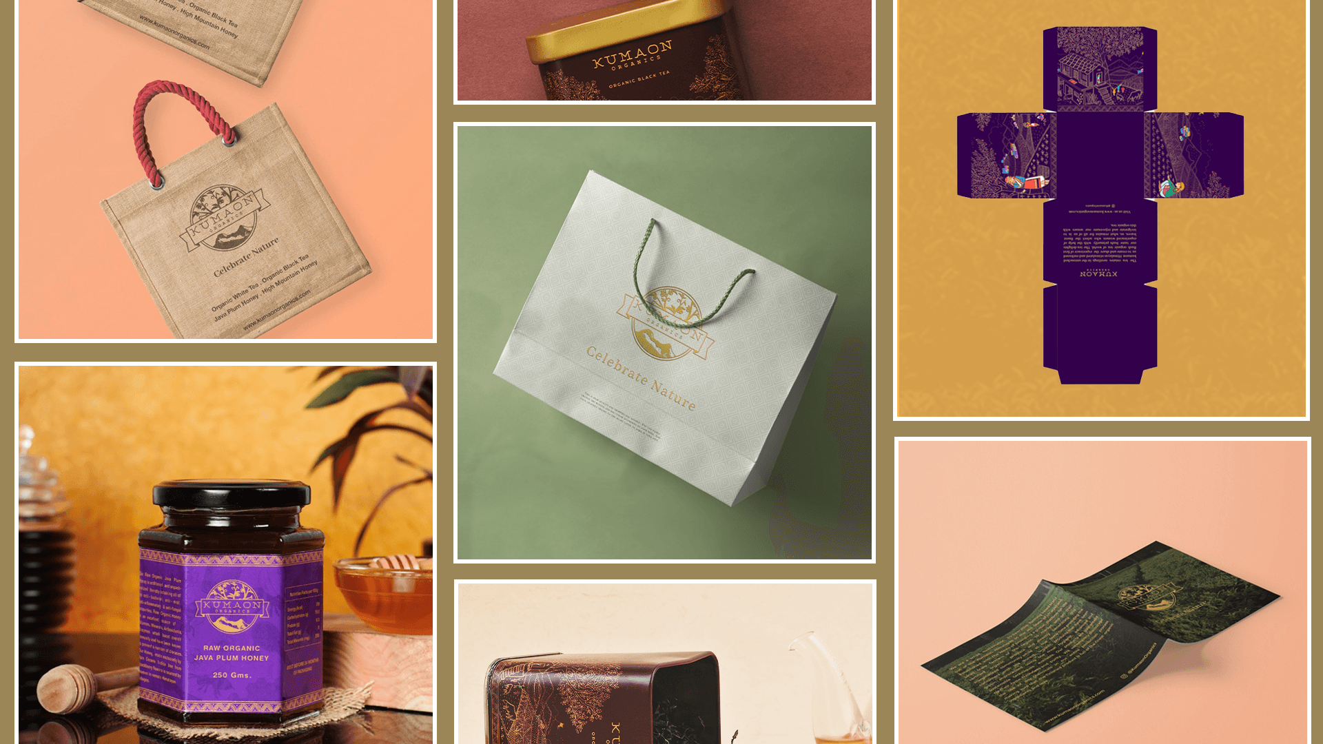
THE PACKAGING
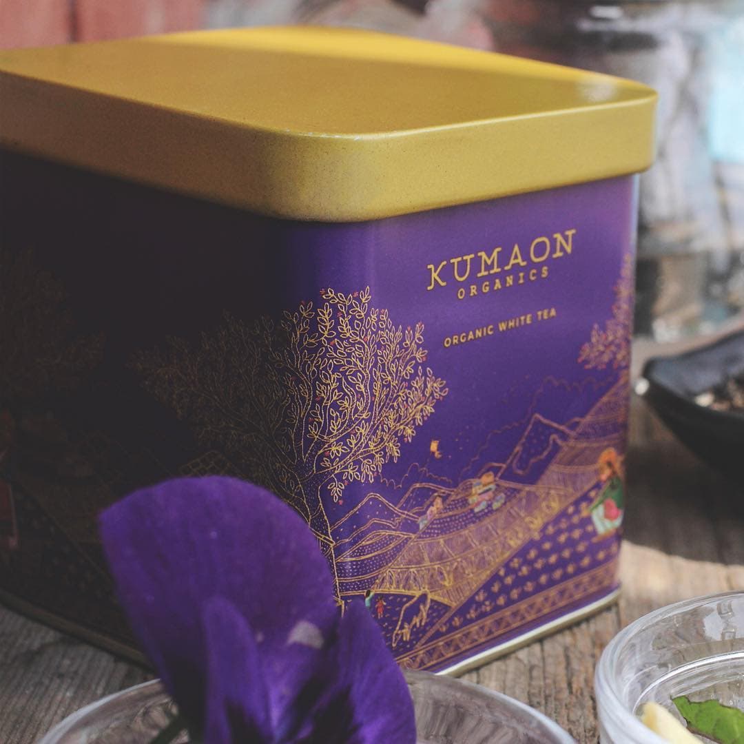
Organic White Tea
THE EVENING SKY IN A TIN
The deep indigo echoes the Kumaon sky at dusk. Gold foil illustration wraps the full circumference — a continuous folk-art scene of mountain life. Inside: white tea leaves hand-plucked at 1,800 metres, dried without oxidation.
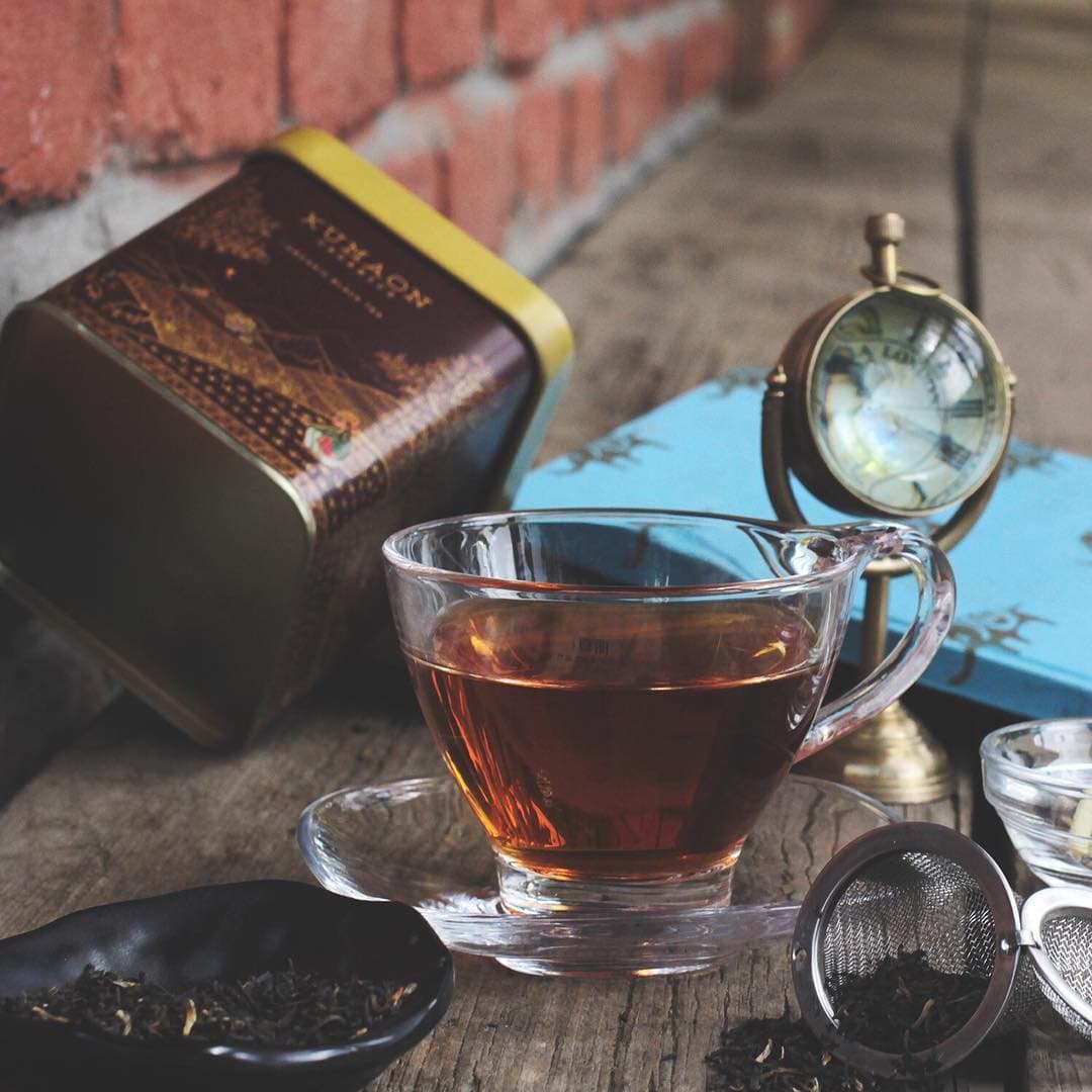
Organic Black Tea
THE WARMTH OF THE EARTH
Crimson for the richness of a properly brewed orthodox black tea. The same continuous illustration — this time rendered in warm ochres and burnt sienna against deep maroon. Brew at 100°C for 3–5 minutes.
WHAT WE DELIVERED
From the first sketch on paper to the final frame of video — everything.
BRAND NAMING & STRATEGY
From roots to identity
We began by articulating what Kumaon Organics stood for — organic provenance, women-led farming, Himalayan purity. Then we built a brand narrative that everything else would grow from.
LOGO DESIGN
The circular badge
A hand-crafted emblem combining the native Kaphal plant and the Himalayan ridge. It was designed to feel like it was always there, not designed at all.
TIN PACKAGING
Hand-drawn, then digitised
The entire tin surface is a single continuous Pahari folk-art illustration. It was sketched by hand, coloured digitally, and applied to two distinct tin colourways for White Tea and Black Tea.
BRAND COLLATERAL
Every surface, one story
Business cards, letterhead, envelopes, jute tote bags, kraft paper bags, brew guides, and thank-you cards were all designed within the same visual world. Every touchpoint kept the same handcrafted narrative intact.
WEBSITE UI/UX & DEVELOPMENT
Built in React, built to sell
A full e-commerce experience was planned across 10+ pages from discovery to checkout. The journey was designed mobile-first and developed in React.
SOCIAL MEDIA + VIDEO
The full picture
Content strategy, photography direction, social media execution, and video production shaped the brand beyond packaging. The result was a presence that lived as powerfully on a phone screen as it did on a shelf.
THE COLLATERAL

THE IMPACT
The scale of what grows here.
25
HIMALAYAN VILLAGES
450
WOMEN FARMERS
2,500
ACRES FARMED
USDA
CERTIFIED ORGANIC
❝
This is not just about selling tea. It is about making sure the women who grow it can live with dignity.
— Gaurav Ladwal, Founder & CEO, Kumaon Organics
WEBSITE & DIGITAL
Built to sell. Designed to story-tell.
The e-commerce experience was designed in parallel with the brand identity — every page built to reflect the warmth and provenance of the product. React front-end, mobile-first, 10+ pages from discovery to checkout.
FRAMEWORK
React.js
PAGES
10+
APPROACH
Mobile First
COMMERCE
Full E-commerce
THE THINKING
THE ORIGIN
Kumaon is not a backdrop — it is the entire point, where the altitude, glacial water, and women who hand-pluck every leaf are the product itself rather than marketing claims.
THE MARK
The circular badge was designed to feel like it predates the brand, as if it was always the seal of this region and not something a studio invented last Tuesday.
THE ILLUSTRATION
The entire tin surface is a single Pahari scene, a folk-art tradition from the Kumaon hills used as a living illustration of the supply chain with every figure, leaf, and mountain drawn by hand.
THE WORLD
From the evening-sky indigo of the White Tea tin to the glacier-fed green of the website, every colour was chosen to feel like it came from the landscape and not from a palette picker.
SERVICES DELIVERED
NEXT PROJECT
Curries and Kababs
Restaurant Branding · Visual Identity · Packaging · 2016
View Case Study →
Building a brand that needs to feel like somewhere?
Tell us about your product. We will build the world around it.
Start the conversation →