CASE STUDY · BRAND IDENTITY
Arjoi Mart
Identity · Branding · Packaging · Print & OOH
THE BRIEF
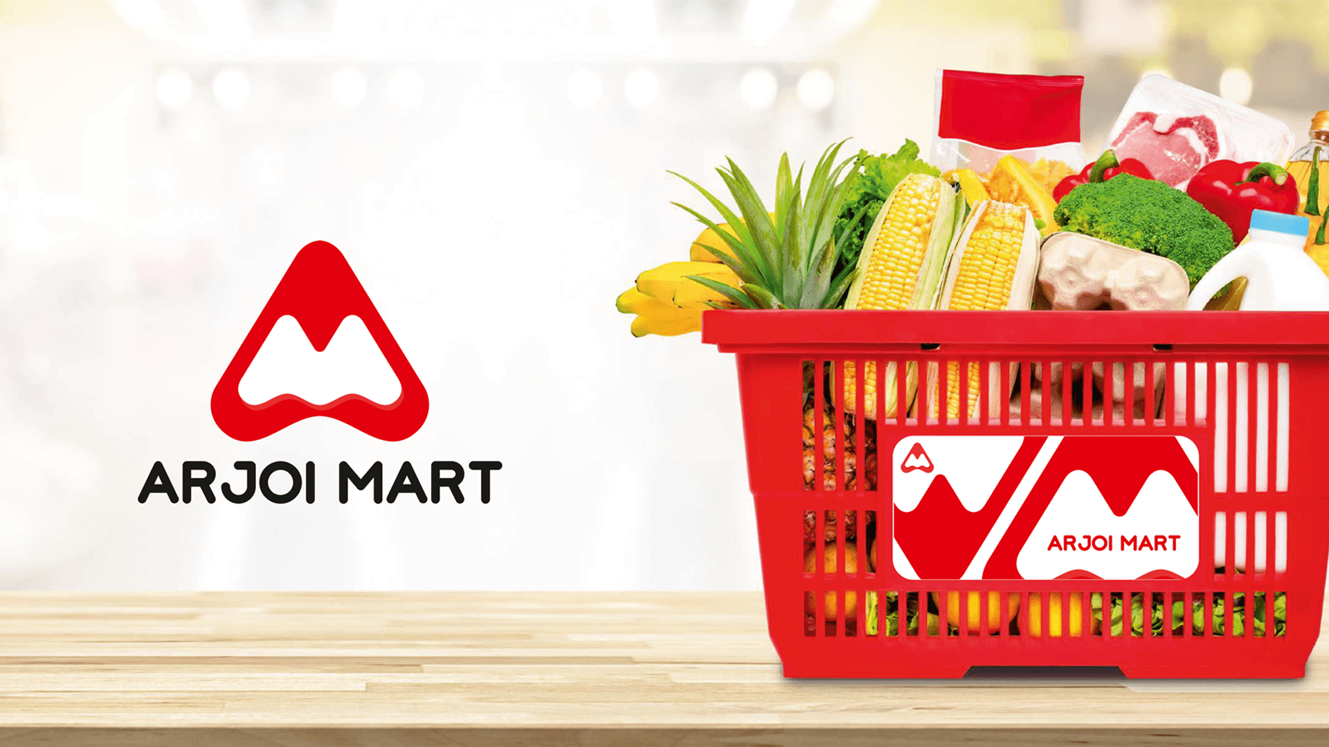
A grocery mart that needed to feel like everyone's mart.
Arjoi Mart came to us with a straightforward ambition: build a grocery brand that works everywhere — on a store shelf, in an app, on the side of a van, and on a highway billboard. They had a name, a location in Naraina, New Delhi, and a category spanning natural plant-based staples all the way to household cleaning products. What they needed was a visual identity that could hold all of that together without feeling corporate, cold, or generic. The challenge was not creativity — it was cohesion across a product range that most brands take decades to build.
THE CREATIVE CONCEPT
“The logo is a single mark that contains three ideas: the letter A, the letter M, and the shape of a shopping cart. Every customer who looks closely enough finds all three.”
The result is a brand mark that works at 5px on a sticker and at 5 feet on a store signage board — because the idea behind it is simple enough to survive any scale.
From a blank page to a brand that runs on 20+ touchpoints.
LOGO & IDENTITY
Three ideas, one mark
The triangular red mark combines the initials A and M with the silhouette of a shopping cart — a monogram that communicates the brand name and the business in a single locked shape.
BRAND GUIDELINES
The full system, codified
Every rule for how the brand lives — colour values in HEX, RGB, and CMYK, logo construction grids, clear space rules, and approved colour and background variations for every use case.
COLOUR PALETTE
Red that means business
The primary red (#E31E24) is drawn from the visual language of Indian retail — high-energy, high-trust, and immediately readable at distance on shelves, packaging, and outdoor hoardings.
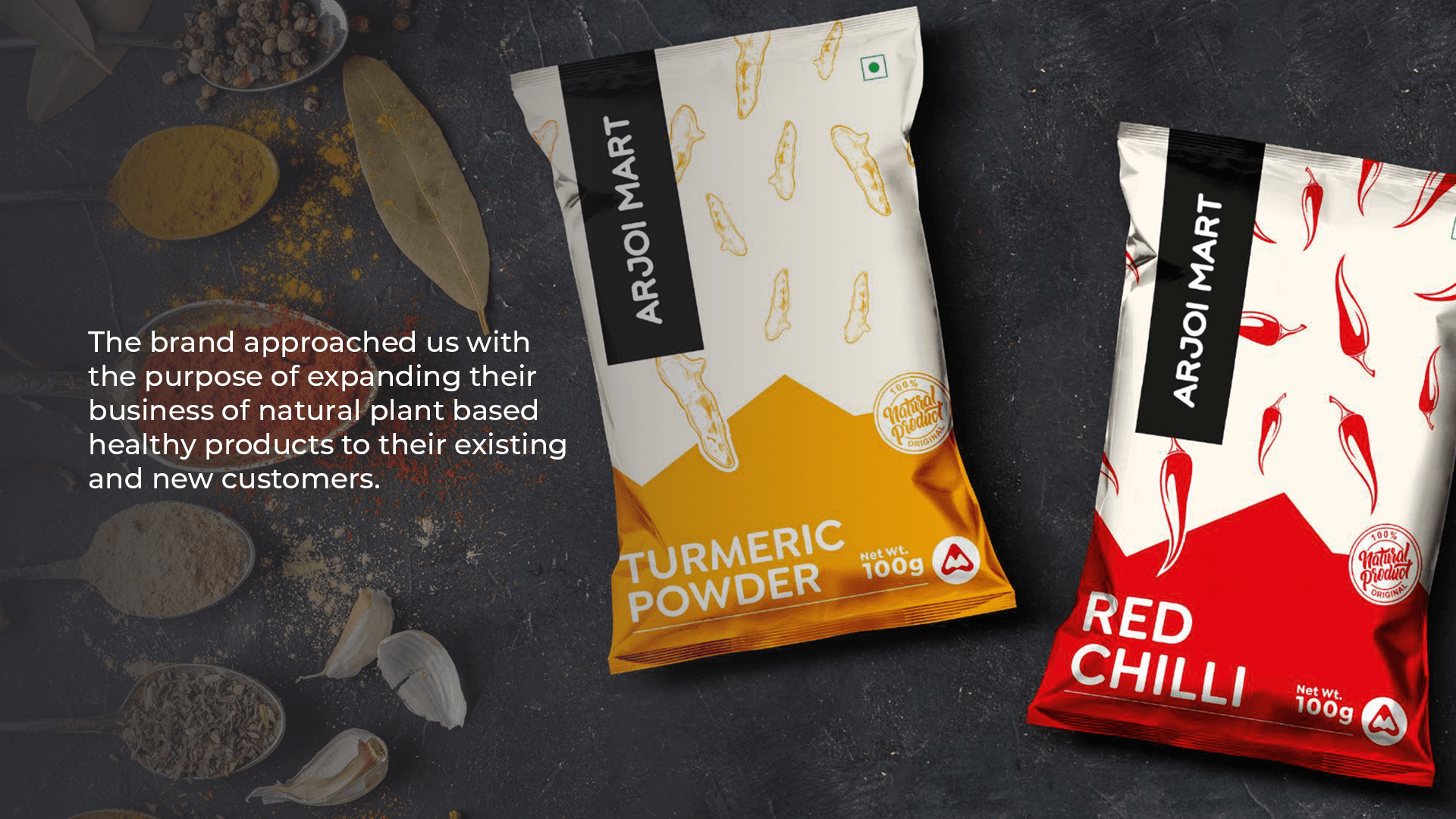
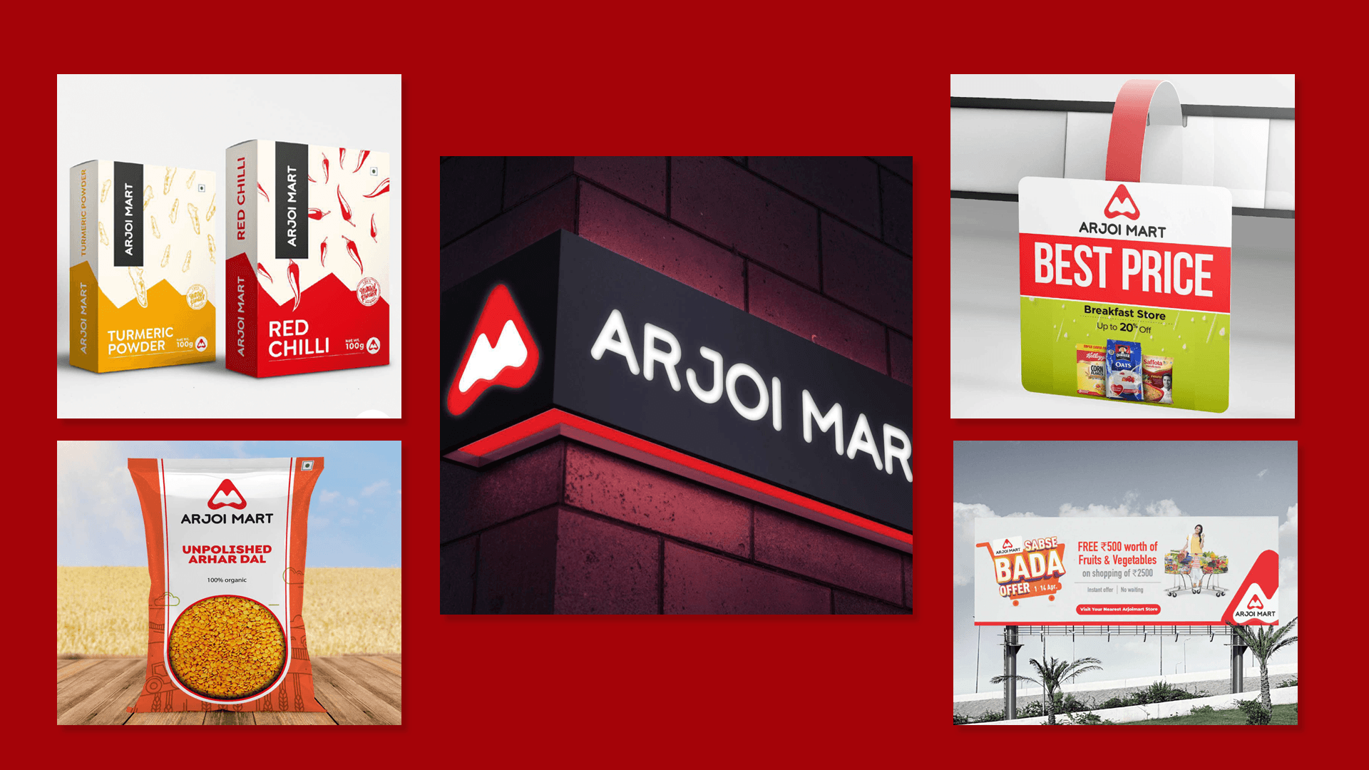
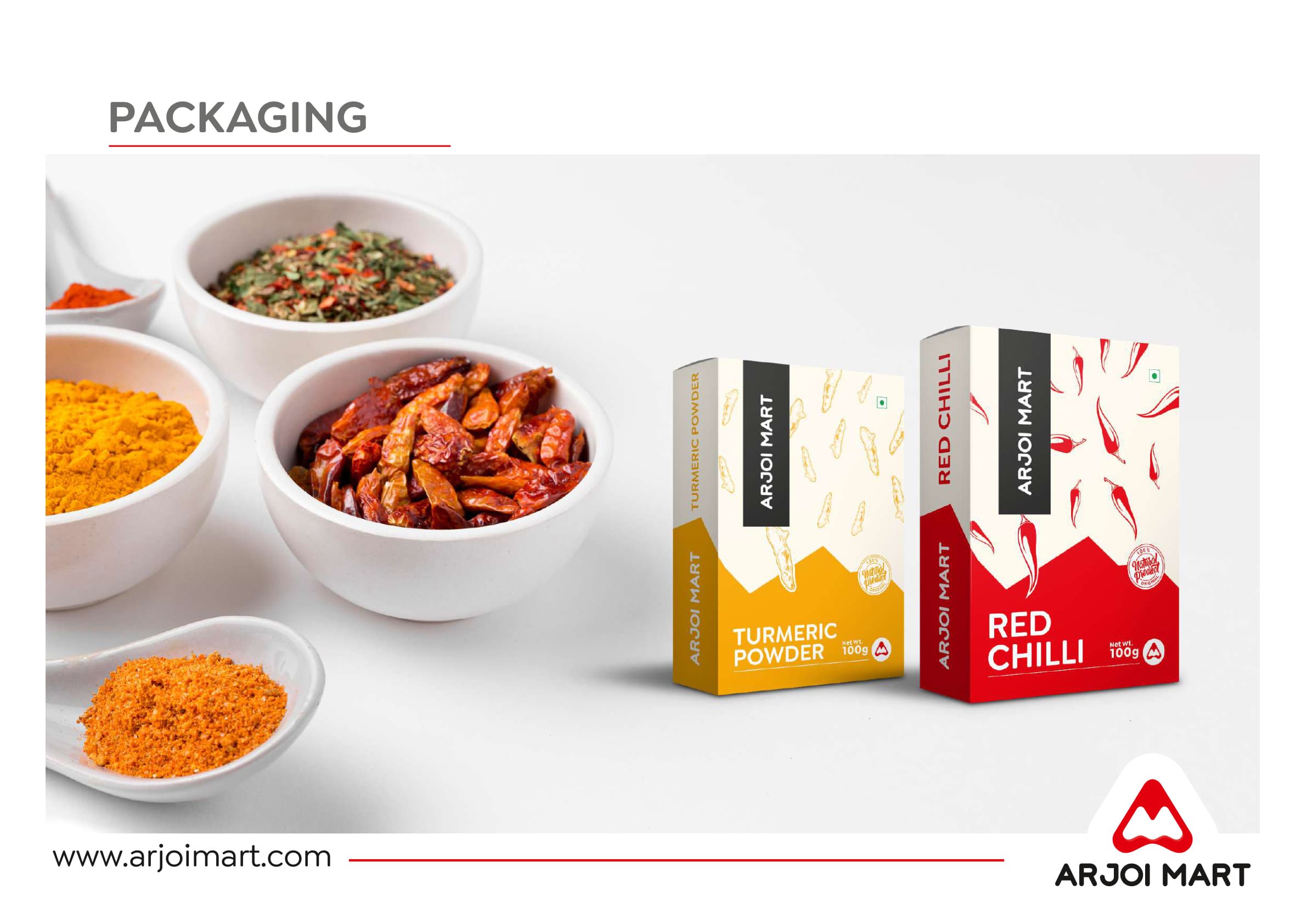
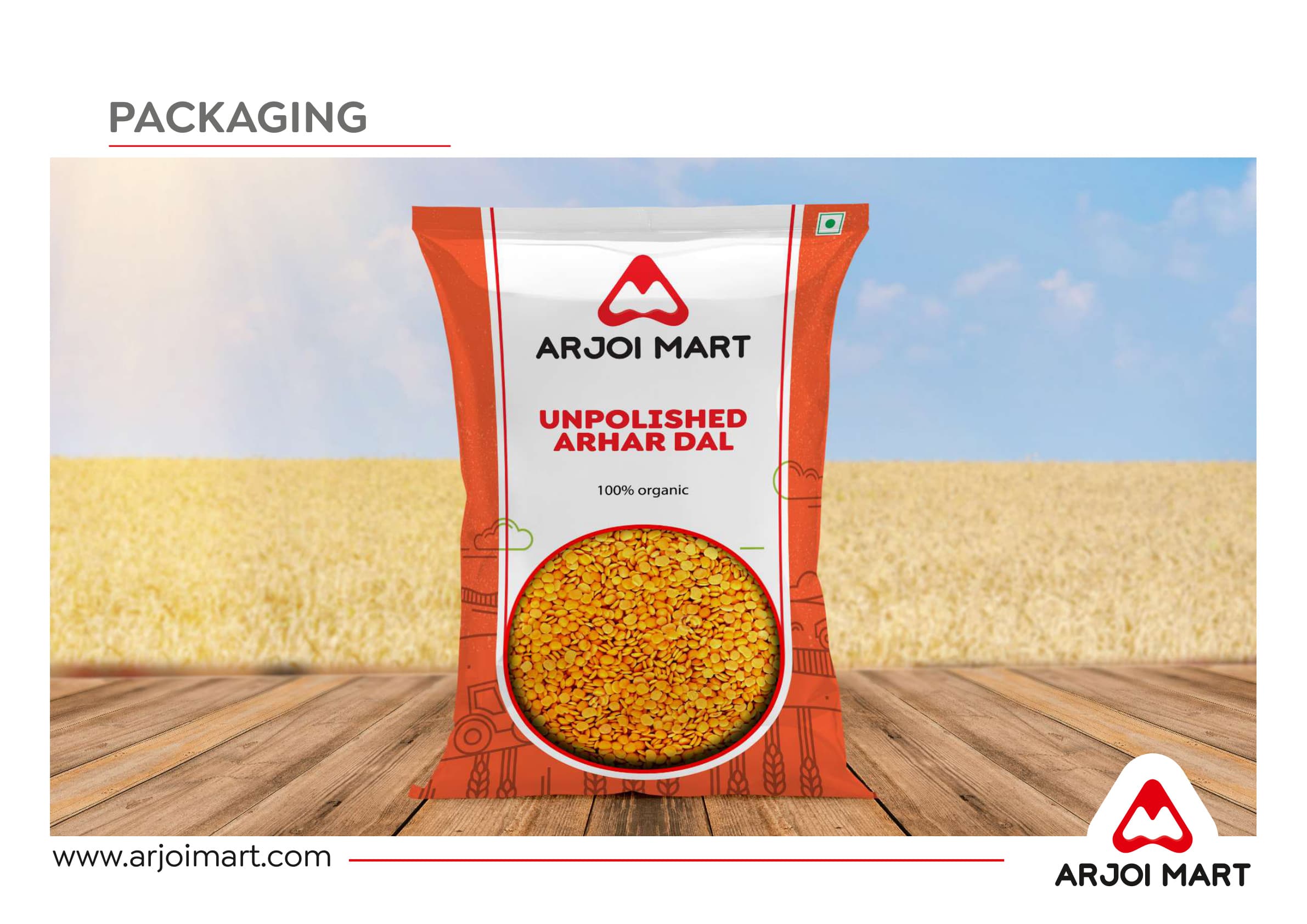
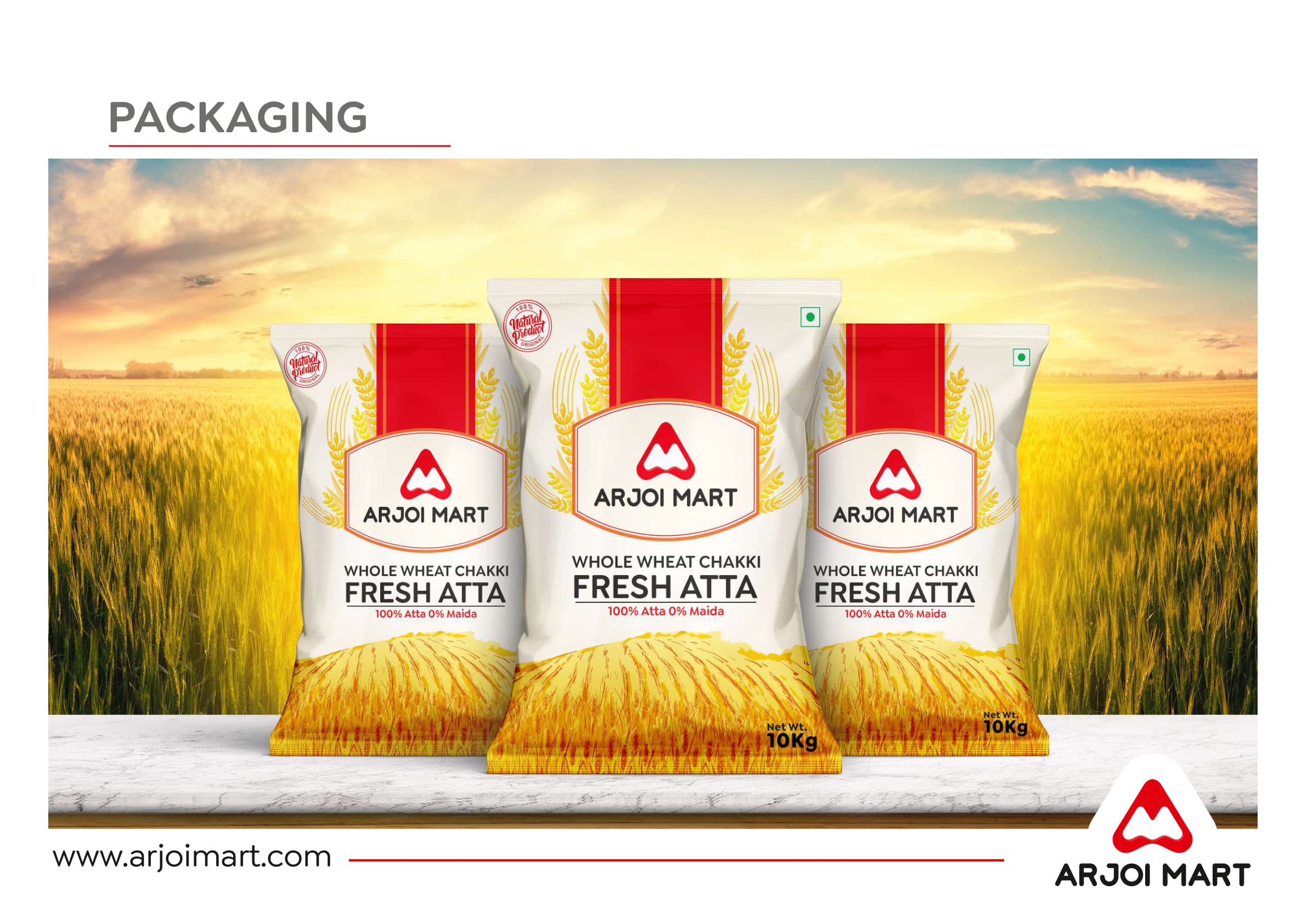
PACKAGING
Every SKU, consistent
Eight product categories designed — spice pouches, atta bags, dal packs, ketchup pouches, cleaning sprays, detergent powders, and milk cartons — all carrying the same visual DNA without feeling templated.
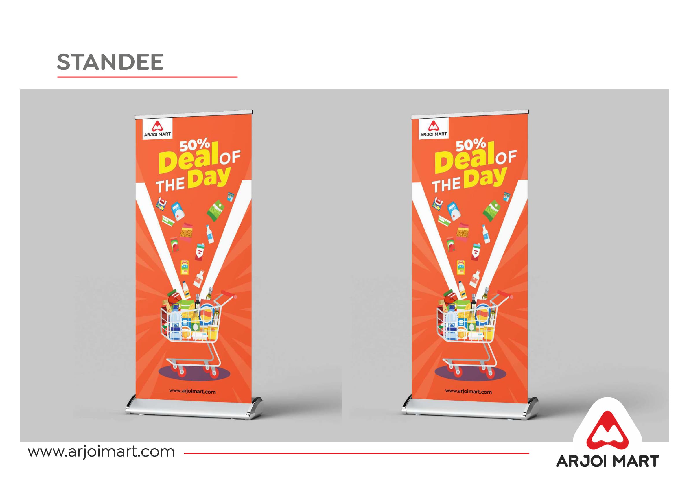
PRINT & COLLATERAL
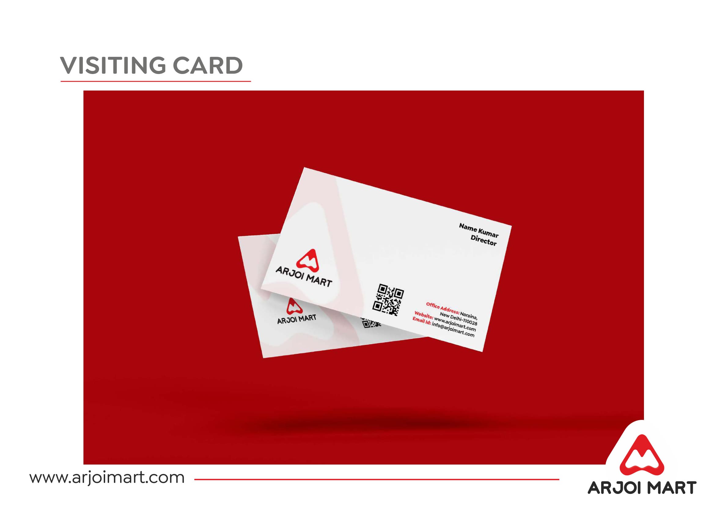
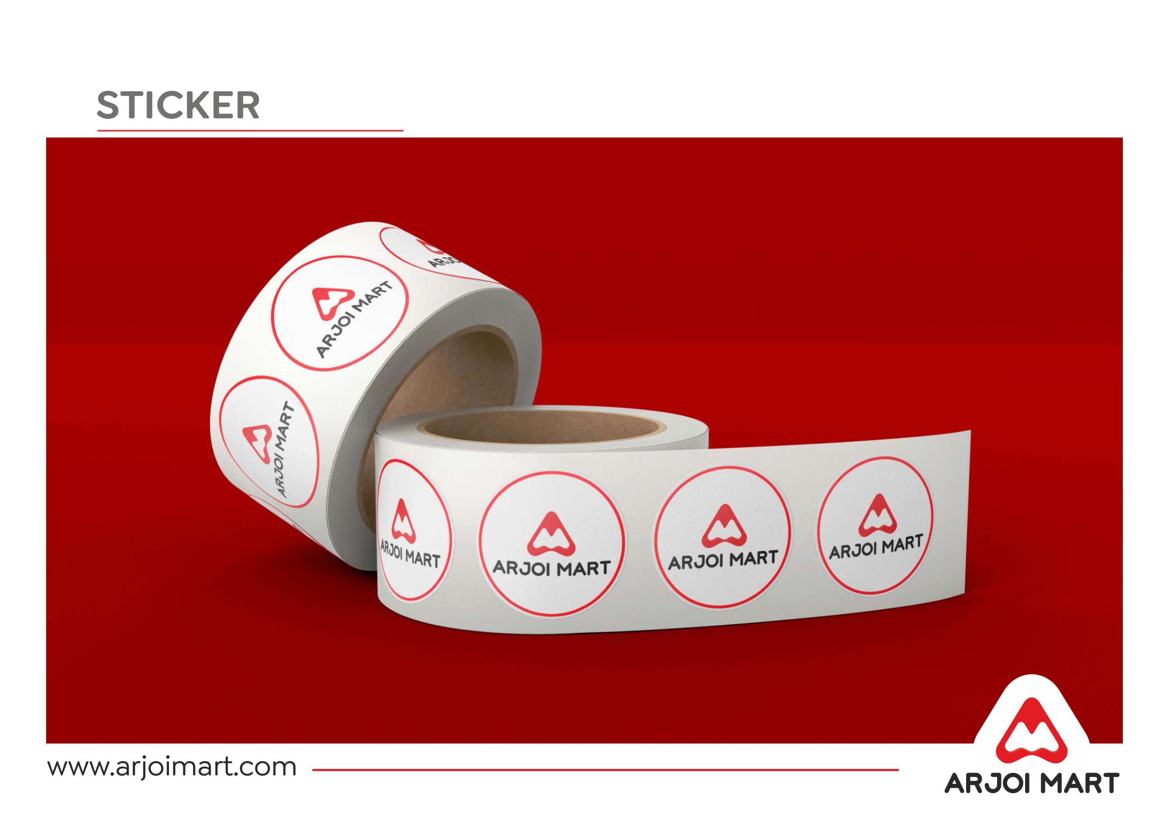
Everything a brand touches
Visiting cards, letterhead, stickers, carry bags, T-shirts, calendars, and a pyramid desk calendar — every surface was considered as a brand moment.
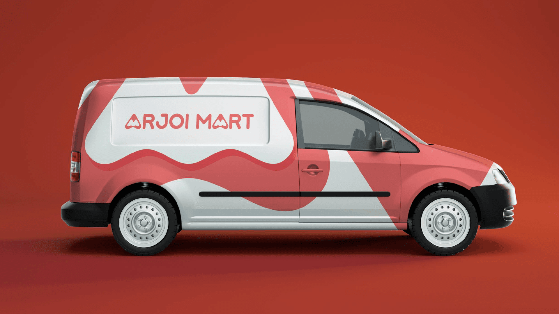
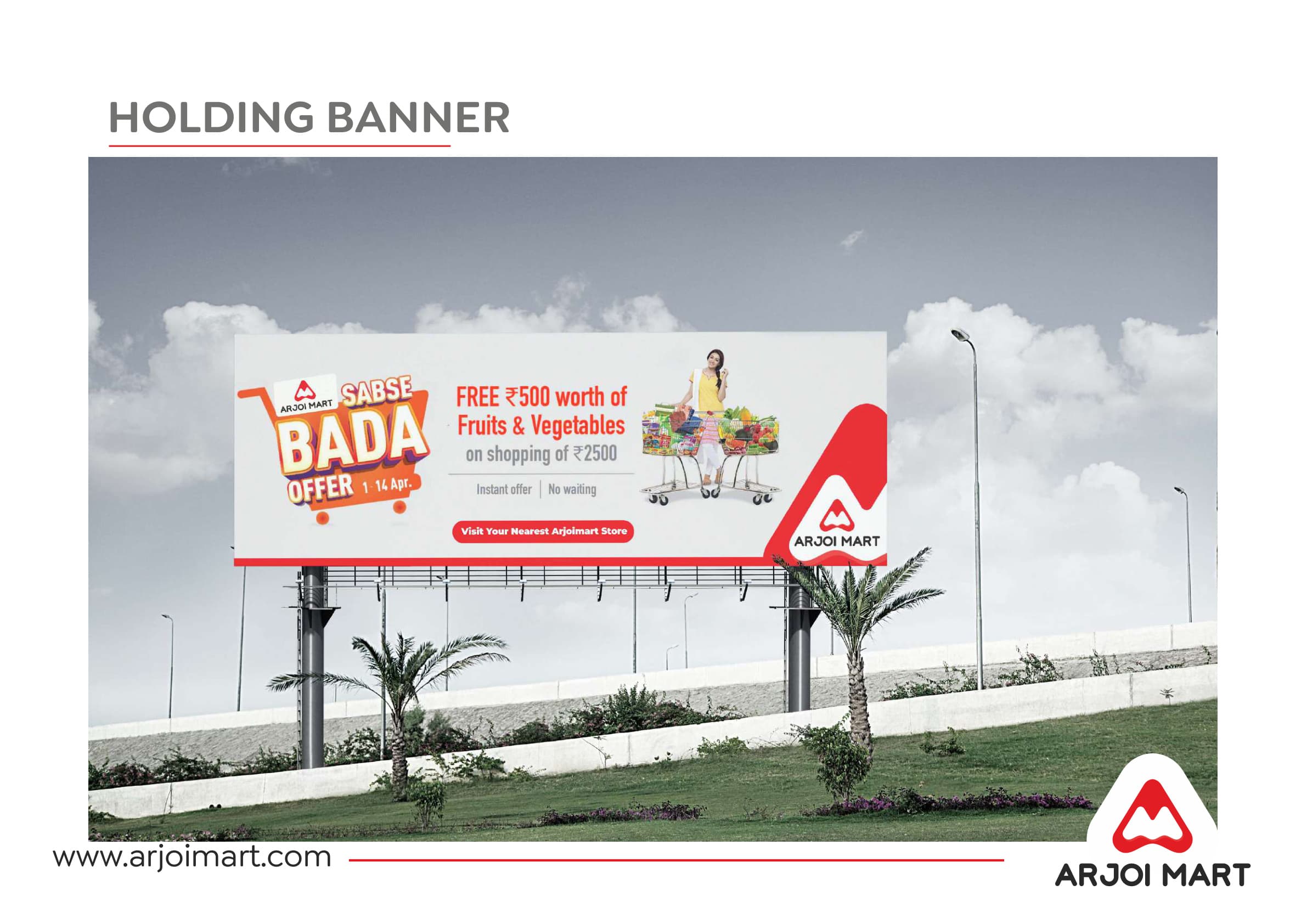
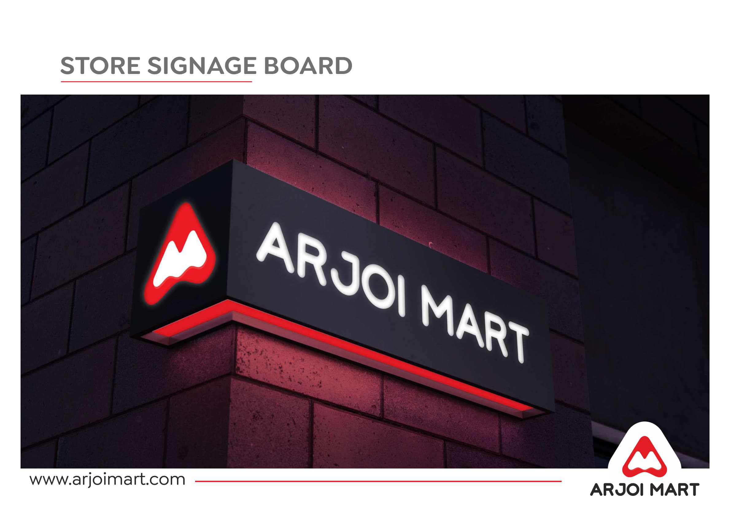
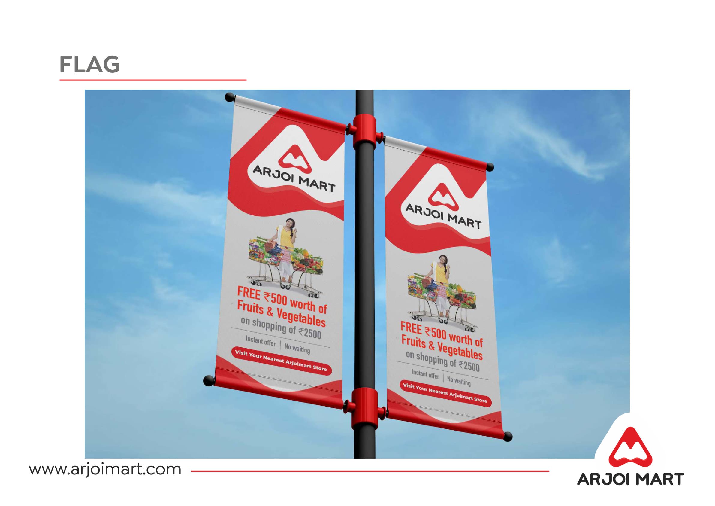
OOH & ENVIRONMENTAL
Hoardings. Vans. Store walls.
The identity was deployed across highway-scale holding banners, delivery van wraps, store signage boards, mall hanging posters, and street-pole flags — built for a brand that needed to be impossible to miss.
The brand, in the real world.
Identity that works at 5 pixels and 5 feet — and at 50 feet on a highway.
THE MARK
The A+M+Cart monogram was the creative breakthrough — a mark that earns a second look from anyone who sees it and rewards the customer who finds all three shapes inside it.
THE RANGE
Designing for eight product categories simultaneously meant the packaging system needed rules flexible enough to accommodate spice yellows, detergent blues, and dal oranges without ever losing the Arjoi Mart brand signal.
THE COLOUR
High-energy red is the anchor — the one constant that makes a turmeric pack and a highway hoarding and a delivery van feel like they belong to the same family.
THE SCALE
The true test of any grocery brand identity is whether the same mark that fits on a 100g pouch can hold its own on a 40-foot billboard — and for Arjoi Mart, it does both without modification.

Building a product brand that needs to work on shelf and at scale?
Tell us about your brand. We will build the identity that holds everything together.
Start the conversation →